I was playing around in Photoshop the other day after getting inspired by a fellow Zazzler’s awesome Stargazer Lily Thank You card.
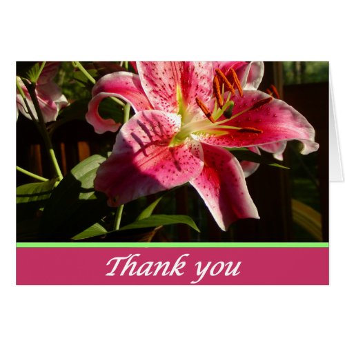
I think I like what I ended up with, although I think perhaps the yellow needs to be more orange to better go with the coreopsis flower. Any opinions?
It’s funny how you’ll get inspired by something, and then end up taking it in a pretty different direction. The basics are close to the same: a flower close up, “Thank You” text on the front, and a solid color border, but the differences in font choices alone can make a big difference in how something feels.